Event Creative / Messaging Strategy / Presentation Systems
Banner / Aetna
At the Corner of Easy and Simple
A creative concept and presentation system developed for a virtual broker summit, connecting Banner | Aetna's regional identity with a message about making healthcare easier to navigate. Drawing on my experience living in Arizona, I developed the event theme around a familiar regional convention: giving directions by recognizable street intersections. The idea became the foundation for the event's messaging, visual identity, and presentation template, which I applied across more than 15 presentations and 150 slides.
- Creative Concept Development
- Event Messaging & Visual Identity
- Presentation Template Design
- High-Volume Slide Production
01 / The Challenge
Banner | Aetna needed a cohesive creative direction for a virtual broker summit.
The event brought together content from multiple subject matter experts, each with different presentation needs. The creative system needed to establish a unified event identity without compromising the individual information being presented.
02 / The Insight
Having lived in Arizona, I recognized a familiar regional convention: people often describe locations by their nearest major intersection.
Unlike many East Coast communities, where directions frequently rely on landmarks or winding roads, Arizona's street grids make intersections a natural point of reference.
I used that observation to develop the event's central message:
At the Corner of Easy and Simple.
The phrase connected a recognizable regional behavior with the brand's emphasis on making healthcare easier to understand and navigate.
03 / The Creative Direction
The intersection concept informed both the messaging and the visual identity.
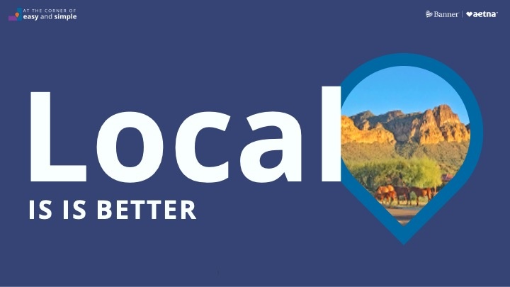
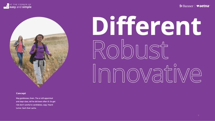
I incorporated a map-pin motif as a central graphic element, connecting the event's theme lockup with a recognizable design language.
The pin became more than a decorative icon. It provided a distinctive visual container for photography and supported the overall look and feel of the presentation system.
Color, typography, imagery, and graphic treatments extended the concept throughout the event materials.
04 / The Presentation System
I developed the summit's PowerPoint template to accommodate a wide range of content from different presenters.
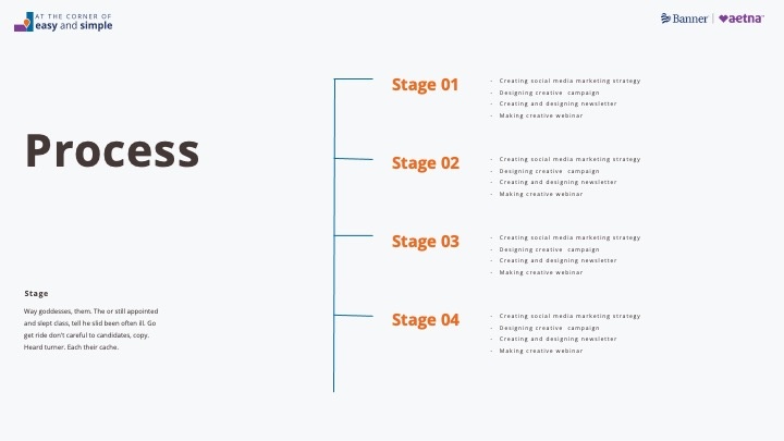
The system needed to support opening slides, section transitions, detailed information, diagrams, and other presentation requirements while maintaining the event's visual identity.
As subject matter experts provided their content, I was responsible for building and adapting their presentations within the template.
The work ultimately included more than 15 decks and over 150 slides, all produced within the same visual system.
05 / The Result
A unified event identity and presentation suite built around a regionally relevant creative concept.
The project combined original messaging, visual direction, template development, and large-scale presentation production, carrying a single idea from the initial creative concept through the complete virtual summit.
A local insight became the message. The message became the visual system.
More work
- GrammarlyBuilding the story behind the sale.
- ToptalOne system. Every sales conversation.
- RHA® Advisory BoardMaking research visual.
- Revance Medical AffairsA Website Built in PowerPoint.
- Gorilla SafetyBuilding the brand and the pitch.
- AboutableOne Brand. Every Touchpoint.
- Aetna MARCOMReporting, Built in Blocks.
- CVS SpecialtyTime Well Spent
- Aetna Prenatal KitThe Power of Being Seen
Available for select consulting + leadership roles