Creative Concept / Patient Communications / Packaging Design
Aetna Prenatal Kit
The Power of Being Seen
A targeted prenatal education kit developed for Aetna to raise awareness of preeclampsia among Black women and encourage conversations with healthcare providers. Working collaboratively with a copywriter and supported by DEI guidance, I helped develop the creative direction, originating the “Be Seen” concept and translating it into transparent packaging and coordinated print materials.
- Creative Concept Development
- Patient Communications
- Narrative & Visual Storytelling
- Packaging & Print Design
Archival packaging and print-design samples. Medical content reflects the original project; this portfolio is not medical guidance. No measured clinical outcomes are claimed.
01 / The Challenge
Aetna needed an educational kit addressing preeclampsia, a serious pregnancy complication that disproportionately affects Black women.
Audience interviews revealed a deeper challenge: Black women described experiences of not being adequately seen, heard, or taken seriously by healthcare providers.
The communication needed to acknowledge that frustration while encouraging patients to recognize warning signs and advocate for appropriate care.
02 / The Insight
The audience research revealed a connection between the healthcare challenge and the emotional experience surrounding it.
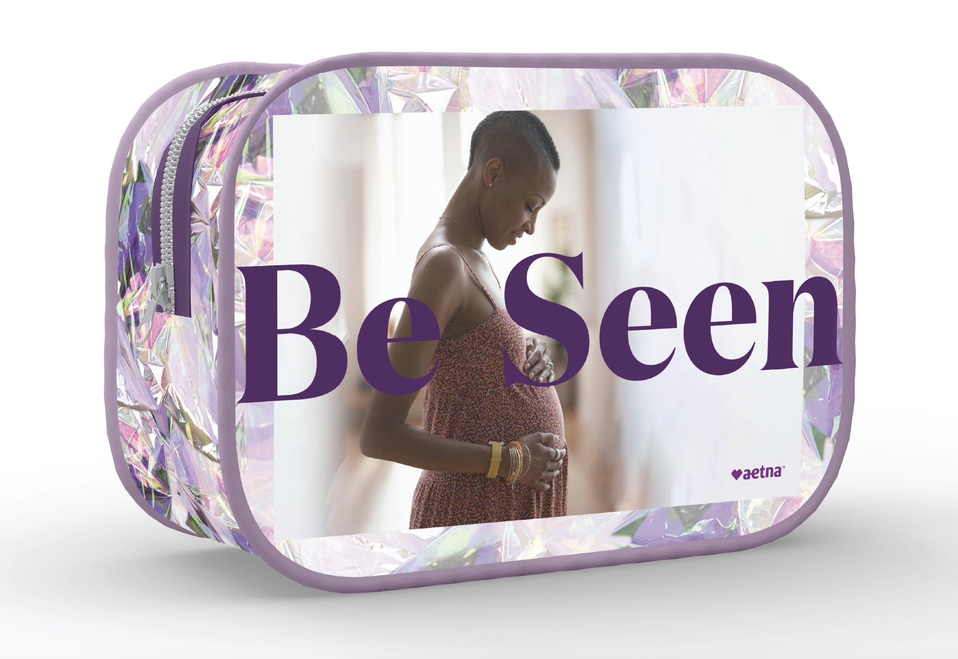
During creative development, I originated the line “Be Seen.”
It worked as both an acknowledgment of the audience's experience and a call to action: make your concerns visible, ask questions, and seek the care you deserve.
The phrase became the first message recipients encountered, establishing the theme for the physical experience.
03 / The Concept
I translated “Be Seen” into a transparent makeup bag filled with translucent tissue paper and an educational booklet.
The see-through packaging gave the message a physical expression, connecting the idea of visibility to the recipient's first interaction with the kit.
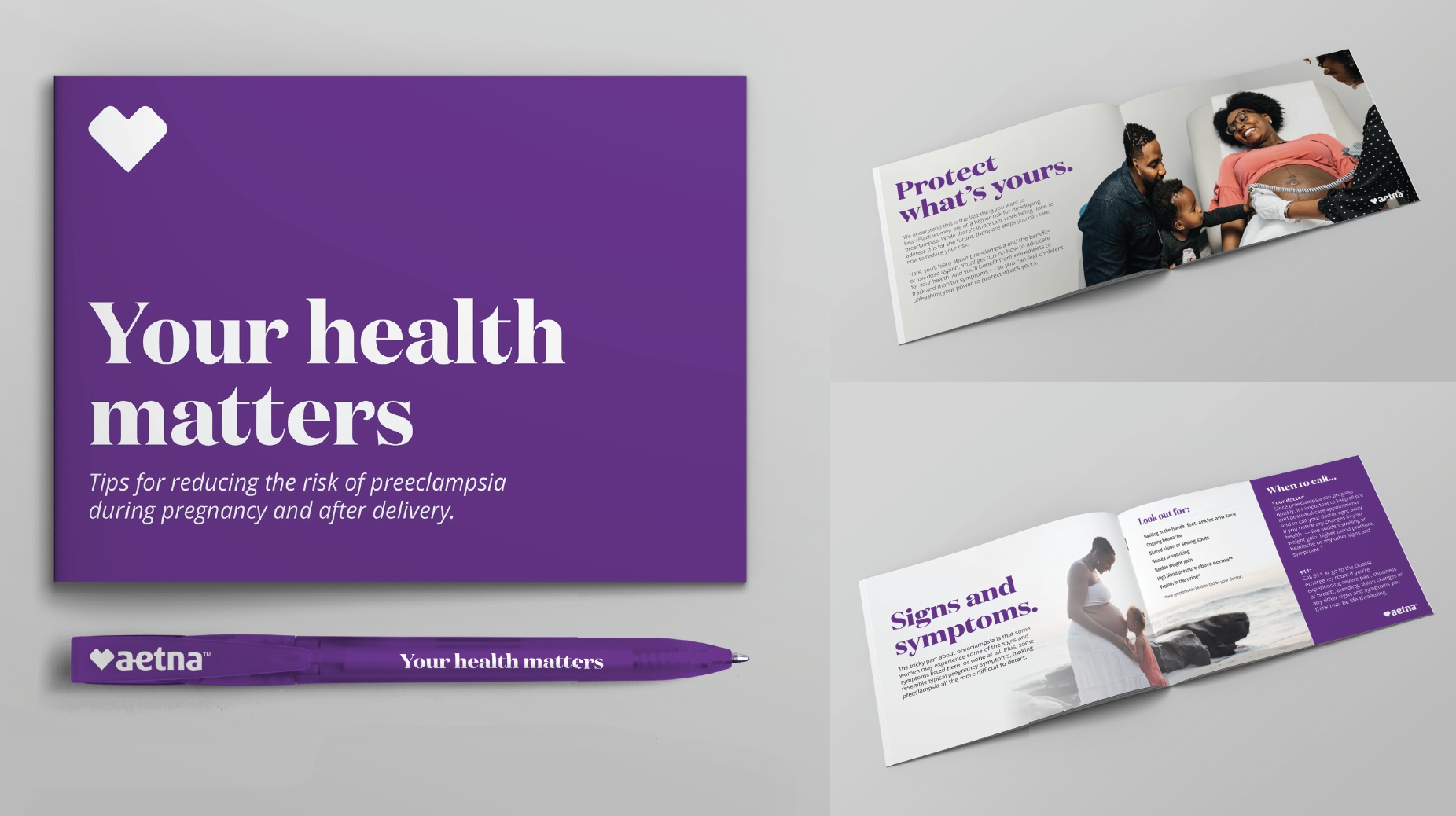
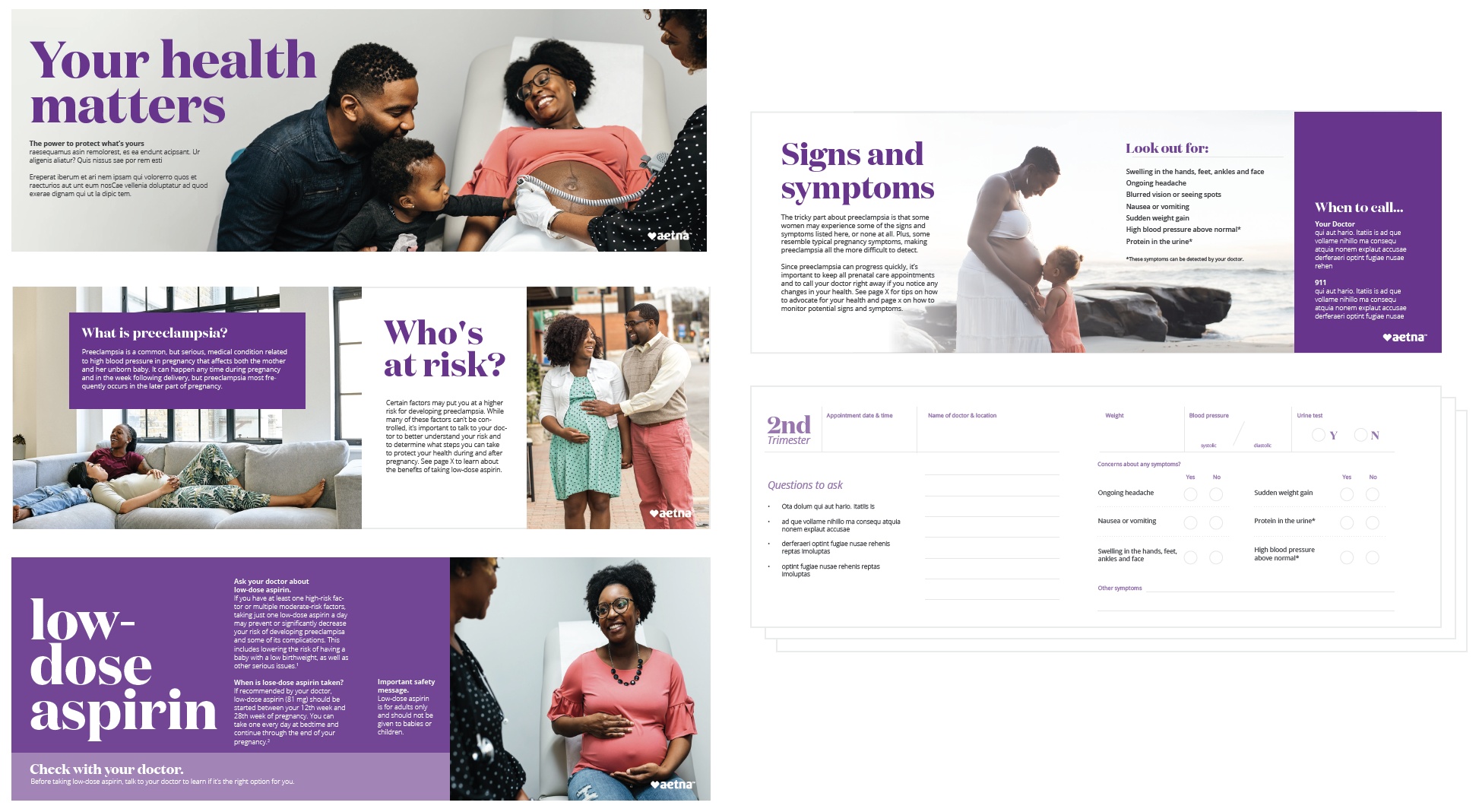
Inside, the copywriter's “Your Health Matters” cover message reinforced the importance of the patient's care, while the booklet provided information about preeclampsia and the importance of discussing symptoms with a healthcare provider.
04 / The Collaboration
Although I was assigned as the designer, the project developed through close collaboration with a copywriter.
We worked back and forth on the theme, informed by audience research and guidance from a DEI resource who helped provide perspective on the intended audience.
My contribution extended beyond visual execution to include the central “Be Seen” concept and its translation into the packaging design.
05 / The Significance
The result was a coordinated patient education kit connecting an audience-informed message with a tangible creative experience.
The project marked an important moment in my development as a creative strategist: recognizing that the strongest design decisions often begin by identifying the connection between an audience's experience and the message they need to hear.
The insight shaped the message. The message shaped the design.
More work
- GrammarlyBuilding the story behind the sale.
- ToptalOne system. Every sales conversation.
- RHA® Advisory BoardMaking research visual.
- Revance Medical AffairsA Website Built in PowerPoint.
- Gorilla SafetyBuilding the brand and the pitch.
- AboutableOne Brand. Every Touchpoint.
- Aetna MARCOMReporting, Built in Blocks.
- CVS SpecialtyTime Well Spent
- Banner / AetnaAt the Corner of Easy and Simple
Available for select consulting + leadership roles